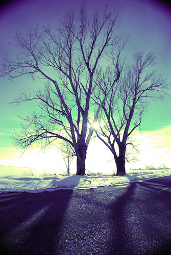
So this first picture is a total mistake. It was really bright and blue the day I shot this so i had put on a ND8 filter along with a warming orange filter. Thing is that i didnt check my white balance. It wasnt on sunny skys as it should have been and this was the awesome result. As far as the rule of thids is concerned i have put the horizon on the bottom third. Oh yeah, and it was shot with a fish eye lens, the further distortion of the image.
Nikon D80 Shutter 1/4000 f/3.5 Focal Length 18mm ISO 400

This is what i was really aiming for. i noticed my mistake before too late, thank goodness, but now i cant tell which i like better... you be the judge. I put a literal twist on the Rule of Thirds. If you were to straighten the image the horizon would be dead on with the bottom third again.
All the settings are exactly the same except that i adjusted my white balance to sunlight

1 comment:
I like the bottom one. The colors are still epic, but looks more natural.
also not sure if people normally comment or not. Hope this is alright..sorry I'm new.
Post a Comment